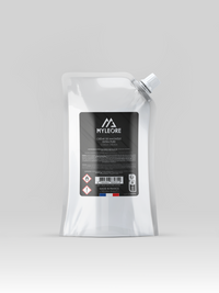
1. Primary Logo – Preferred Usage
The primary Myléore logo is our core visual identity. It is designed to represent the brand in a strong and recognizable way. Recommended usage: On products and packaging. In all official communications (website, posters, brochures, social media, etc.). On promotional and marketing materials.
2. Secondary Logo (Horizontal Version) – Adaptive Usage
The secondary logo is an elongated version of the primary logo. It is optimized for spaces where a horizontal format is more suitable. Recommended usage: When the space does not allow effective use of the primary logo. On banners, email signatures, or materials requiring a wider format. In layouts where graphic balance calls for a more linear solution.
3. Logo Icon – Minimalist and Digital Usage
The logo icon is a simplified version of our visual identity. It is ideal for uses where a subtle brand reminder is sufficient. Recommended usage: Profile picture on social media. Website favicon and mobile app icon. Email signature or small graphic elements where a subtle brand presence is desired.
General Usage Guidelines:
Do not alter the proportions or distort the logo to fit into a constrained space. Always prioritize the white version on dark backgrounds to ensure optimal visibility and maintain brand identity. Using the black version of the logo is permitted, but it should be limited to administrative documents (invoices, quotes, internal files) or when a partner’s visual guidelines do not allow the use of the white logo (e.g., sponsor lists, etc.).
Typography – Usage Guidelines:
The official typeface of Myléore is Century Gothic. Titles and Key Elements: Use CENTURY GOTHIC BOLD, size 10 pts, in uppercase letters to reinforce visual impact. Body Text: Prefer Century Gothic Regular, size 8 pts, to ensure smooth and comfortable reading. Notes and Details (texts in parentheses or annotations): Use Century Gothic Italic, size 8 pts, for clear distinction.